London Hand Institute
The London Hand Institute is a private hand and wrist clinic led by a renowned NHS surgeon in it's early stages of set up. As pressures on the NHS continues to increase, the Institute wants to establish itself as an leader in the private market by making diagnosis of conditions, care, treatment and rehabilitation accessible for patients.
Time
6 week design sprint as part of the Experience Haus programme
Role
I worked with 2 other UX designers. My contributions were project management, research, testing, branding, UI/interaction design and presentation
Understanding the current patient experience
Methods we used were:
• Stakeholder interview
• Quantitative data analysis using NHS statistics
• Qualitative interviews with current patients
• Competitor analysis of private orthopaedic practices in the UK
• Observing users with hand injuries or using their non-dominant hand interacting with phones to understand accessibility issues
• Investigating online forums (medical sites, Reddit, FB)
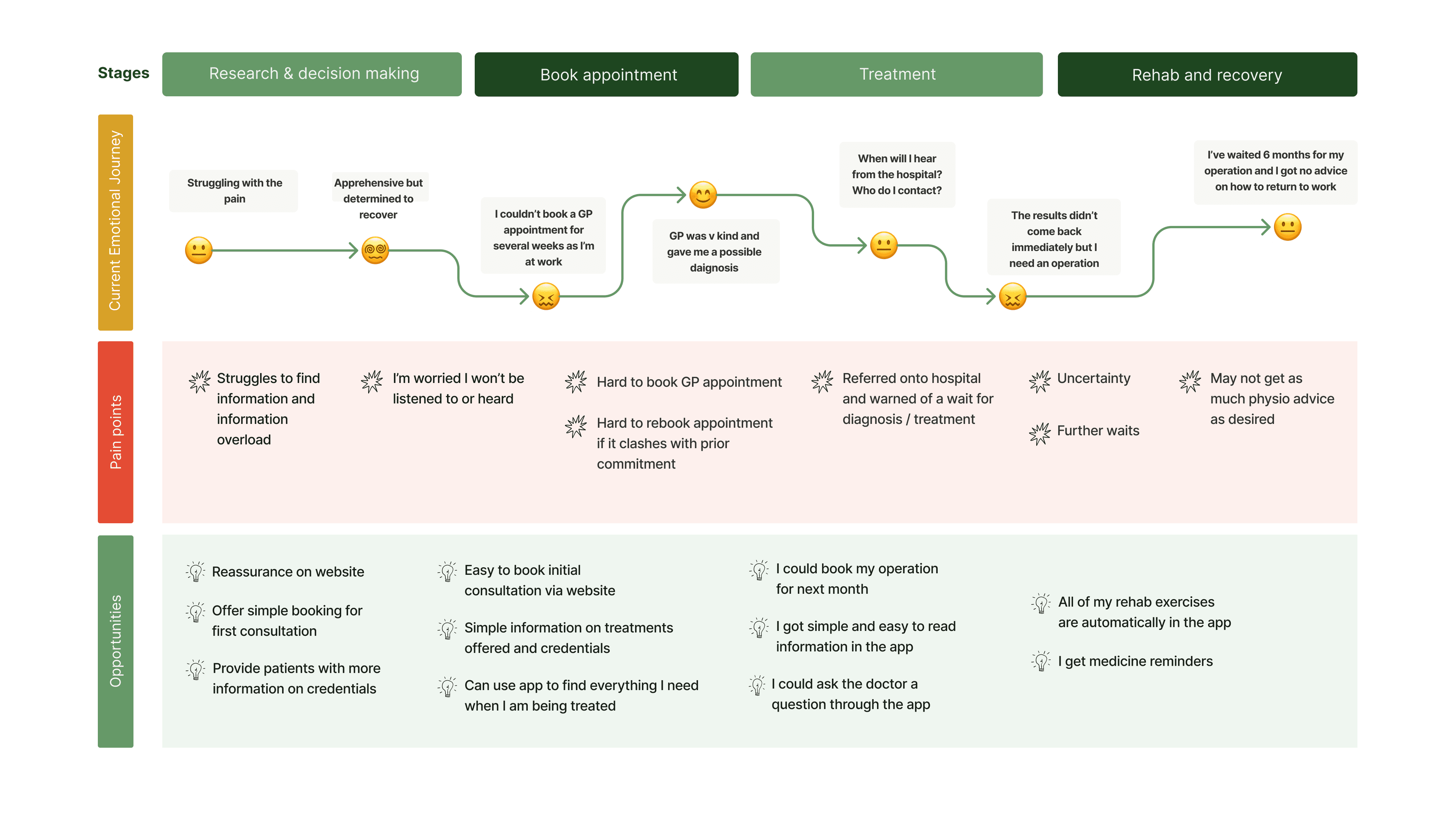
Key insights
Clear communication
Patients need clear communication after diagnosis and get frustrated and anxious where they struggle to speak to the right person to get answers
Online Community
Patients use forums and online content (e.g. YouTube advice on exercises) to fill the gap where medical professionals don’t communicate
Flexibility
Patients are frustrated where there is no flexibility in appointments and it is hard to exercise any choice they have
Range of mobility
Some patients find it harder to use computer and mobile devices, but can be helped by accessible design
Who are the patients?

Lifestyle Restorer (Mark)
• "I've tried to self-treat my sports injury but it's not going away"
• "I've had to miss work for previous NHS appointments, but had no choice because I didn't know when I could get another one"

Quality Seeker (Mary)
• “I first had carpal tunnel syndrome a decade ago and had a terrible experience with the GP. Now it's back”
• “I’ve waited months and months for my operation”
• “I’m paying for myself and I want to make sure the surgeon will help me”
Defining the problem
Problem Statement
Patients need a credible and easy to follow platform to efficiently schedule an operation and access comprehensive rehabilitation guidance to restore hand mobility and function.
Hypothesis
We believe that building a platform with transparent pricing, quality indicators for surgery and personalised support post operation, Mary will receive the best possible treatment and feels she has invested in a worthwhile product.
We'll know this to be true when we see patients like Mary purchasing surgery, app downloads to help their rehabilitation, as well as providing positive feedback on the treatment received.
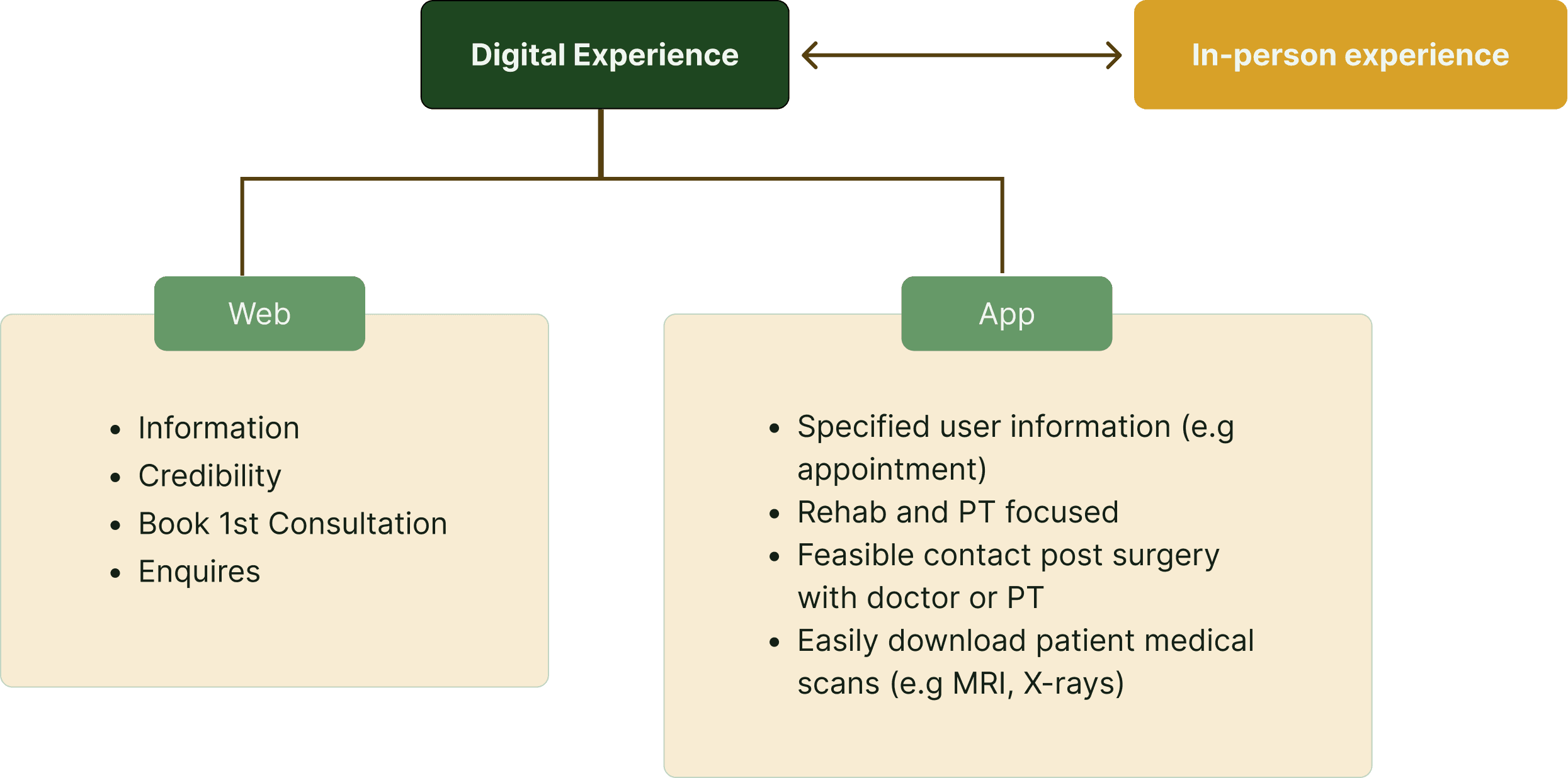
Integrating digital and physical UX
We chose to develop two products, a website acting as the 'front door' to the service, and an app coming in at a later stage in the patient journey after the first in person consultation.
User flows: from seeking information to rehab


Information architecture


Ideation
We prioritised a mobile first approach for a number of reasons:
• Analytics from nhs.uk show 81% of sessions were via mobile devices in 2022
• COVID-19 made mobile medical passes a familiar way for the UK population to access information
• Distilling information down to its simplest form makes content more accessible to anyone with cognitive disabilities
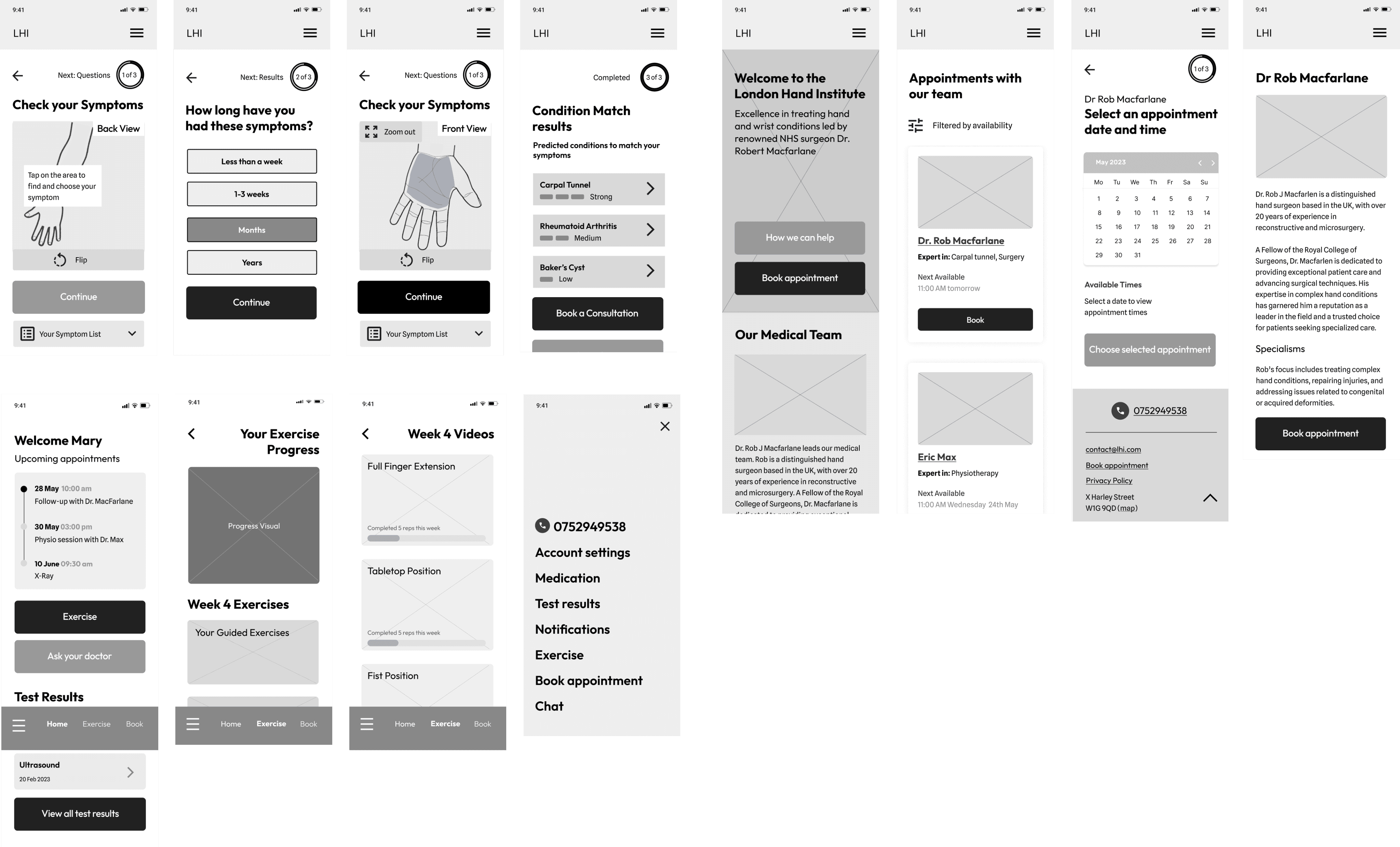
Learnings from usability testing
We conducted an inital round of usability testing with 7 participants, with 4 using their non-dominant hand to complete the following three tasks:
1. Navigate to and use a tool to check your symptoms
2. Book an initial consultation on the website
3. Complete one video exercise in the app

Standing out in the market
We chose to develop a brand identity as it played an important role to help differentiate the new business. As the majority of competitor websites were oversaturated clinical photography and shades of blue, I went with a colour palette of greens and off-white create an inviting, trustworthy yet still professional feel.

Design system
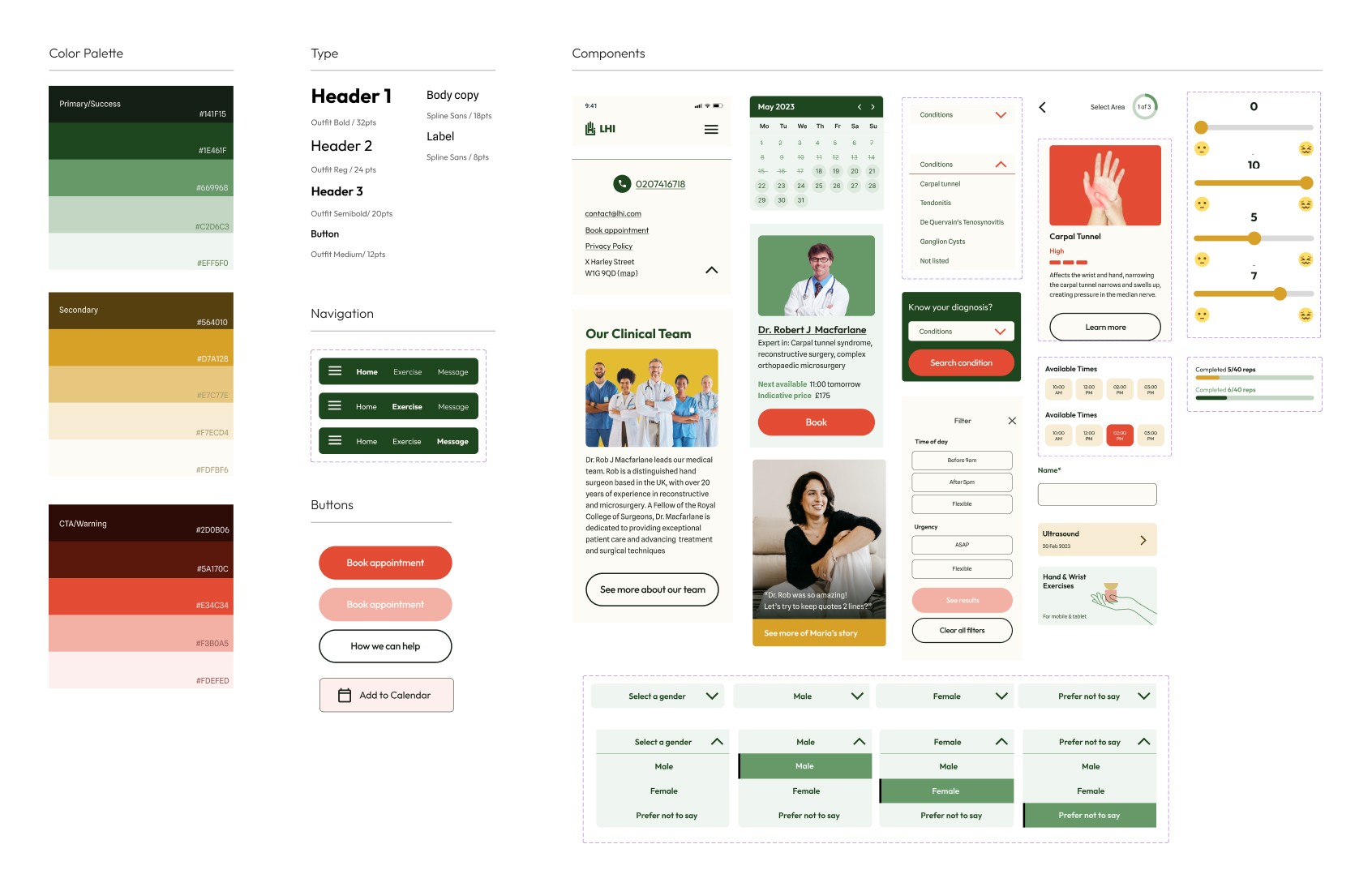
Website
App
Tablet rehabilitation concept

Presentation


Next steps
• Review digital design outputs with additional stakeholders
• Refine the digital design as the physical clinic is set up to align patient experience and business strategy
• Test - integrating digital product testing with wider concept for clinic
Reflections & learnings
Taking initiative:
A key lesson learned was to keep the project moving despite uncontrollable circumstances in a collaborative environment. This meant making decisions on task delegations, client communications, and keeping teammates informed with progress and next steps.
Implementing Kanban and standups:
Starting a team Kanban board allowed the project to move on much more smoothly than before, as we could visualize and priotoritize all tasks together. Daily stand ups were also extremely valuable to keep communication flowing, especially while working remotely.
Being pragmatic and flexible:
I learned to be more comfortable with letting go of the details and consider the bigger goals of the project. This meant re-assessing, prioritising and pivoting when needed, for example, cutting down on certain flows or features.